Savour
Location: Zimbabwe
Scope: Brand Strategy, Brand Design, Packaging Design


The brief
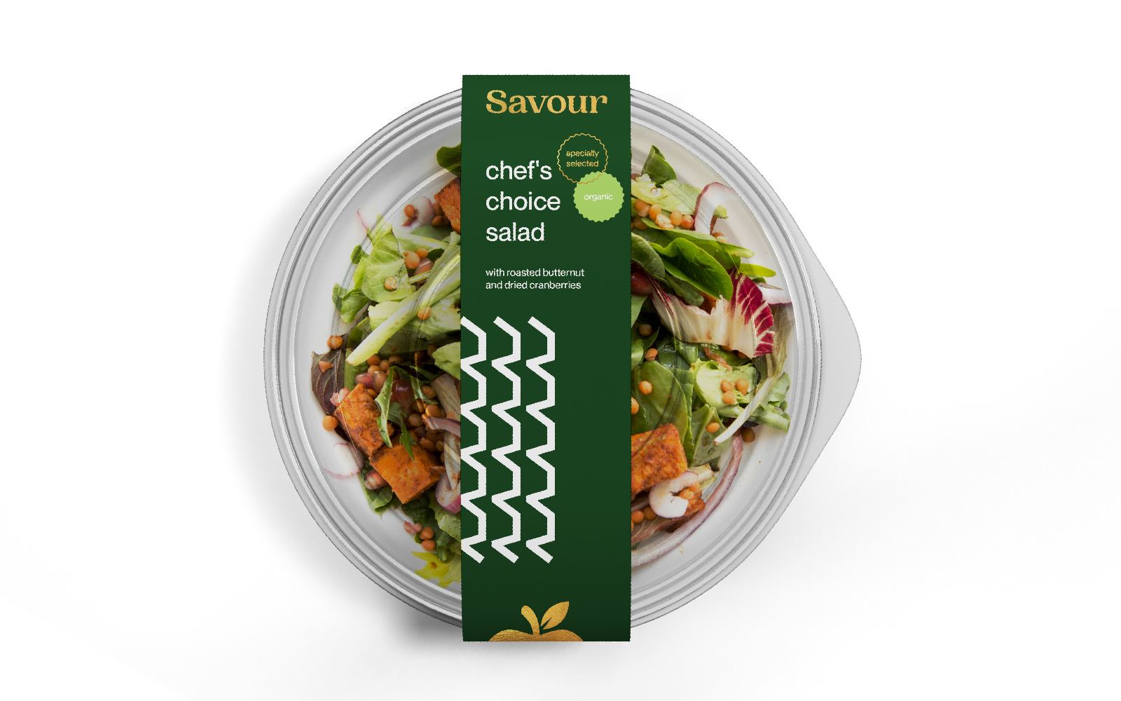
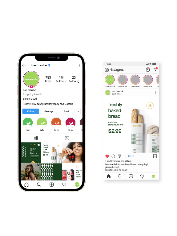
As part of our work with Bon Marché, Ok Zimbabwe’s more premium offering, we were briefed to develop a name, logo, and packaging design for the brand’s private label across meat, fresh goods, delicatessen, bakery and FMCG. It was important for us to communicate Bon Marché’s elevated positioning, as well as its focus on wellness and vitality. At the same time, as a private label for everyday items, it needed to feel accessible and inviting to all shoppers.

Our solution
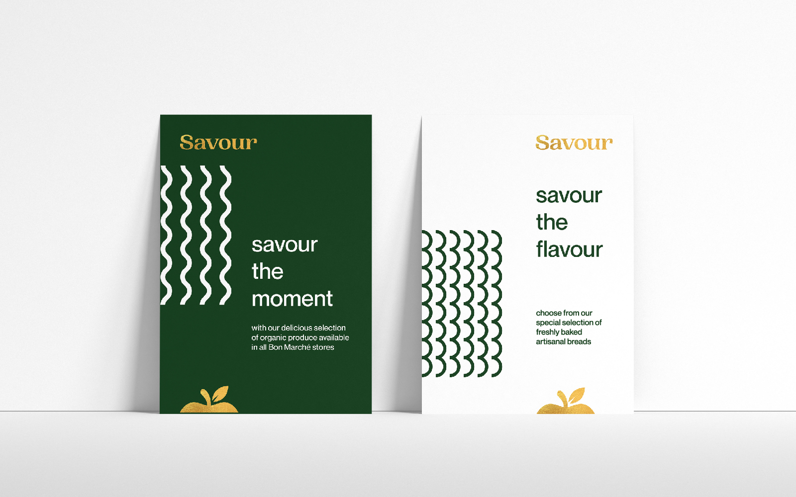
The name Savour is a simple expression of what we want customers to experience – the joy of food. As a word, it subtly communicates a premium feeling, while still speaking to a human truth around enjoyment that everyone can relate to.
The kernel of our visual inspiration for this brand came from the act of meal preparation. Slicing bread, vegetables, fruit and meat is central to creating dishes, and we examined the different knife serrations and marks that were distinctively tied to this world. This helped us to develop unique patterns that each sub-category could own, establishing a visual identity that was cohesive yet diverse. Distinct background colours were also selected to ensure that visual cues could be established throughout packaging and communication.
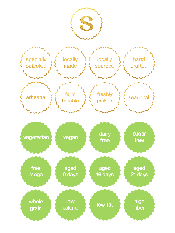
A clear tie back to the Bon Marché brand was a key imperative for the job, so we developed and endorser symbol that could work across the various touchpoints. We elevated the apple element of the logo with a gold colour treatment and used on all of the packaging and brand extensions. This harmonises beautifully with the deep green and white palette core to Savour.


