Location: Zimbabwe
Scope: Brand Design, Interior Design, Technical Documentation


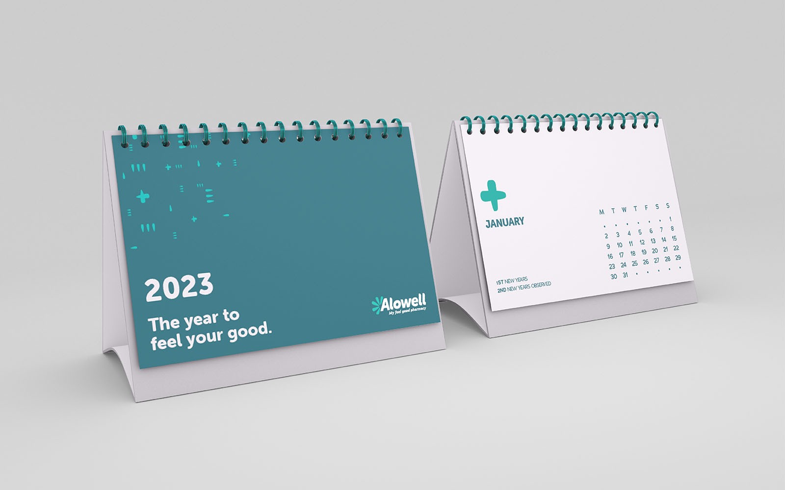
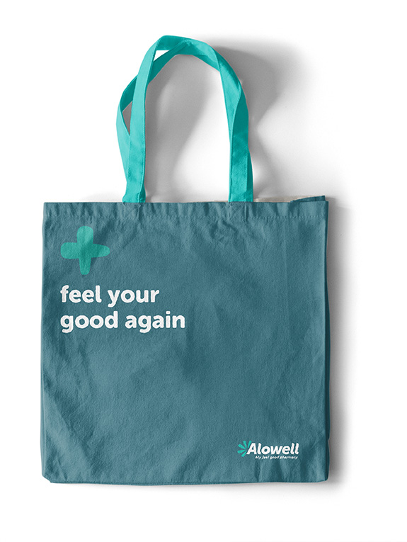
When creating the new healthcare brand for OK Holdings, we were asked to take a comprehensive approach, from name definition and identity creation through to store design. Centring the concept around the core promise of “my feel good pharmacy”, all of the elements we developed would need to evoke warm, comfort and a personal touch.

The aloe is a plant with numerous medicinal applications and is known for its healing properties within Zimbabwean culture. Combining this metaphor for health with the word “well” allowed us to craft a brand name that was distinctive, yet familiar. The softness in the word and concept was further emphasised with a visual identity that makes use of soothing shapes and gentle lines. This in turn influenced the typography and graphic devices, which have a rounded aspect to them too. Photography emphasises wellbeing in the abstract, with happy, healthy people showcasing the feeling of the brand.
When it came to the store itself, the layout was designed to follow the same soothing lines as the identity. It is open and welcoming, ensuring easy navigation with clearly-defined sections for a range of needs. Soft and calming colours are used throughout, and comfortable seating invites customers to take a pause and or consult with staff. Signage is designed to be simple and easy to read, with positive and friendly messaging, along with icons and symbols for clarity. Different levels of interaction are also taken into account, with space provided for customers to speak privately with consultants when necessary, further enhancing this personal, accessible feeling.


TDC Campus, 52 Marine Drive, Paarden Eiland, 7405, Cape Town
TDC Campus
52 Marine Drive
Paarden Eiland 7405
Cape Town
TDC Campus
52 Marine Drive
Paarden Eiland 7405
Cape Town