OK Mart

Location: Zimbabwe
Scope: Brand Strategy & Design

The brief

OK Mart is the big box version of Zimbabwe’s OK Stores, and our brief was to design a brand and retail environment aligned with the purpose of “bringing you everything you want for your lifestyle”. In doing this, we were asked to embody the “unapologetically bold” personality, emphasising confidence and a larger-than-life approach. Tying back to the emotive cue that unites the OK Zimbabwe stable, this format needs to make a confident statement as the “theatre of happiness” that’s inviting to all.

The brief

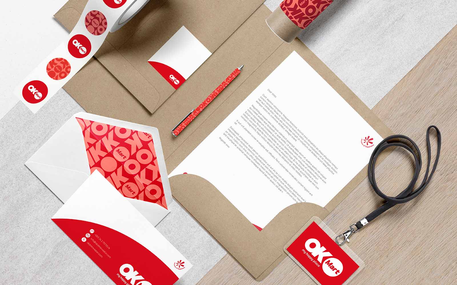
OK Mart is an inspiring retail destination that people love to visit. In refreshing the brand identity, we drew on strong typography and a logo differentiated by a striking icon. The graphic toolkit was fleshed out with dynamic shapes and lines to convey a sense of scale and energy. This is all shared using a confident colour palette with vibrant, high-impact tones. When it comes to typography, we ensured the brand is able to make statements as big and bold as its experience, combining eye-catching call-outs with clean and simple body copy.
Considering the store environment, the entrance was a logical starting point to ensure we made the best first impression. With large-scale signage and dramatic lighting, we could put the brand centre stage, a concept continued throughout the store with focal points and striking displays. By creating and demarcating destinations within this significant footprint, we were able to emphasise that it is “bigger and better” while making it easy to inspiring to shop. All this ensures that these stores remain the landmark in the Zimbabwean retail landscape for years to come.