Location: South Africa
Scope: Brand Strategy, Brand Design, Interior Design, Technical Documentation

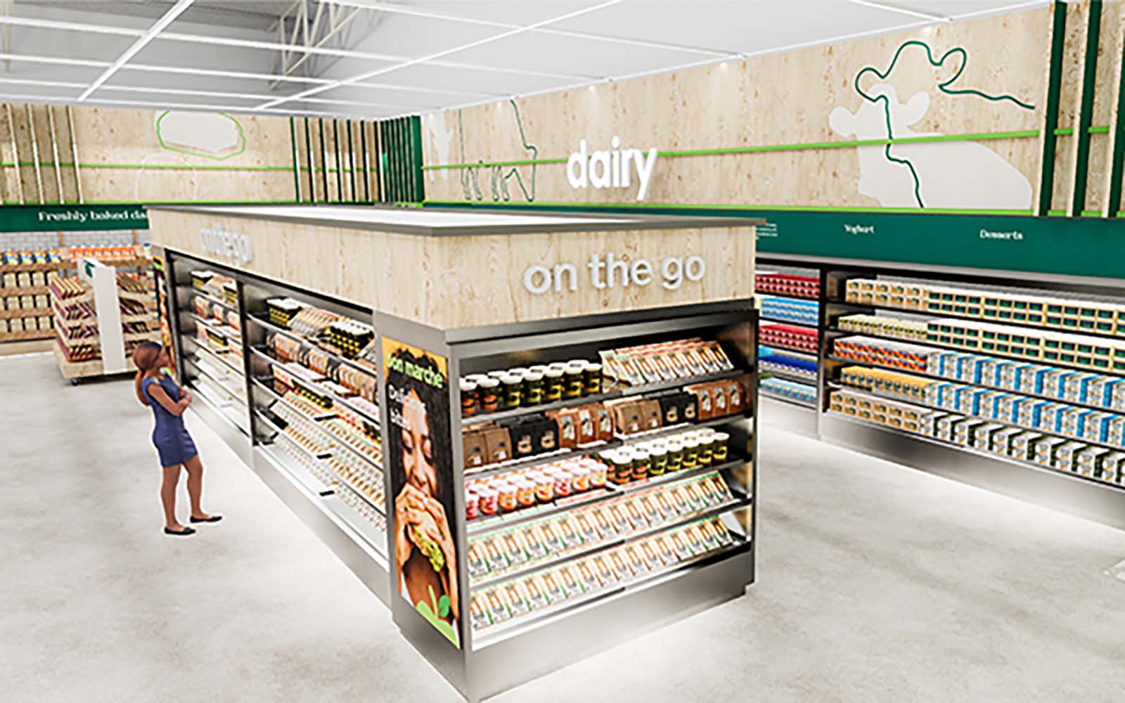
Bon Marché is the more premium format for the OK Group in Zimbabwe. These stores aim to inspire fresh living as the destination for a healthy lifestyle. We were tasked with updating the logo while retaining the equity it has built up in the country. The next step was to refresh and elevate the retail environment to clearly own its elevated positioning in the stable and the local market more broadly.


TDC Campus, 52 Marine Drive, Paarden Eiland, 7405, Cape Town
TDC Campus
52 Marine Drive
Paarden Eiland 7405
Cape Town
TDC Campus
52 Marine Drive
Paarden Eiland 7405
Cape Town